



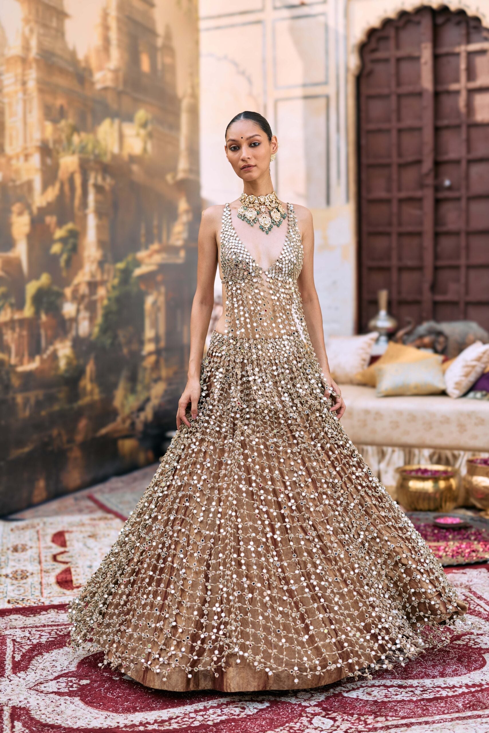
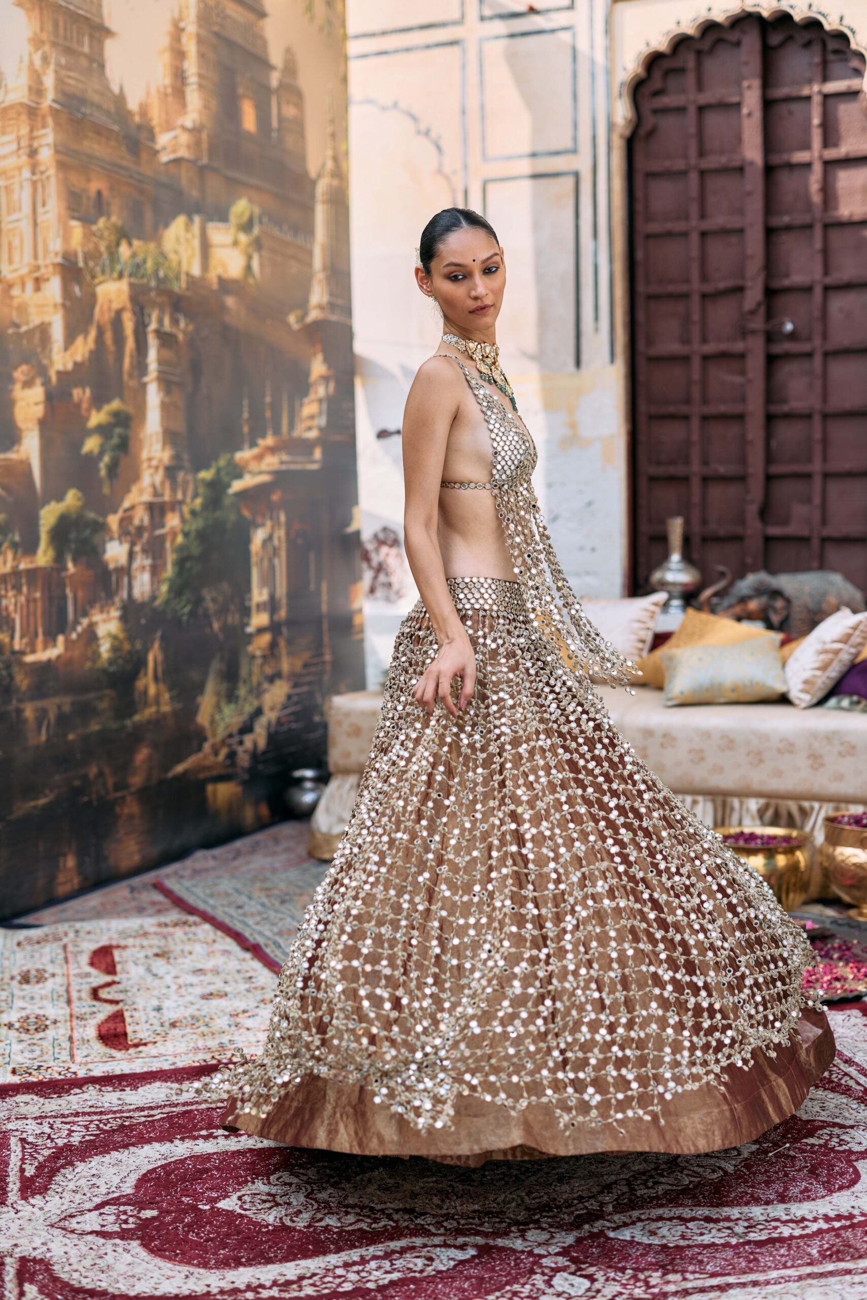


Coordinating Family Looks for a Wedding: Colour Palettes That Work
The easiest way to coordinate family looks for a wedding is to choose one palette per function, let the couple's outfits set the main colour, and give everyone else shades from the same family rather than an exact match. Tonal schemes look elegant and calm; contrast schemes look festive and photograph with more energy. Here is how to plan both.
Key takeaways
- Coordinate, don't uniform: a shared palette looks polished, while identical outfits rarely flatter everyone.
- Start from the bride and groom's outfits and build the family palette around them, so the couple still stands out.
- Use tonal schemes for daytime and religious ceremonies, and contrast schemes for sangeet and reception.
- Give each function its own palette, and share it with the family as a simple colour board with swatches.
Tonal vs contrast: the two ways to coordinate
Tonal (one colour family, many shades)
Everyone wears variations of one hue, for example blush, rose and dusty pink, or butter, mustard and marigold. Tonal palettes look refined and almost effortless in group photos. They work especially well for the pheras, a puja or a daytime ceremony where the mood is gentle. The trick is to vary the depth of shade by generation: lighter tones for younger family members, richer ones for parents and grandparents.
Contrast (two or three colours that play off each other)
Here the family wears clearly different colours that belong together, such as emerald with maroon, navy with gold, or fuchsia with orange. Contrast schemes feel celebratory and suit evening events with dancing. To keep it intentional, limit yourself to two main colours plus one metallic, and split them by side (bride's family in one, groom's family in the other) or by generation.
A simple ratio that always works
Think of the palette as roughly 60/30/10: one main colour most people wear, a supporting colour for a few key people, and an accent, usually gold or silver, that runs through everyone's jewellery, embroidery or footwear. The accent is what ties a contrast palette together.
Five palettes that work for Indian weddings
1. Sunshine: yellows, marigold and white (haldi)
Haldi is the one function where almost every family already coordinates. Make it look considered by mixing shades instead of everyone wearing the same lemon yellow: mustard for parents, butter and lemon for siblings, white with yellow accents for the men. Prints and light embroidery keep it playful.

Yellow Print Embroidered Anarkali And Dupatta Set by Mehak Murpana, ₹32,500
A printed, embroidered yellow anarkali for the bride's sister or mother. It is part of our Ready to Ship range, which helps if the family plan comes together late.

Yellow & White Silk Hand Embroidery Kurta Set by SDS by KUSHAL SHAH, ₹55,000
Yellow with white is an easy way to bring the men into the haldi palette without them looking like they are in uniform.

Yellow Georgette Sharara Set for Festive and Haldi Celebrations by Jhamb Threads Kids, ₹11,900
A yellow georgette sharara lets the youngest family members join the palette in something light and easy to move in.
Find more options in our haldi edit.
2. Pastel garden: mint, powder blue and blush (mehendi or day events)
Pastels are a tonal scheme with a twist: they mix different hues that share the same softness. Mint, powder blue, lilac and blush sit together beautifully in daylight and against floral décor. Keep every outfit at a similar lightness, so no single colour looks heavier than the rest.

Mint Blue A-line Set by Kapaas, ₹20,250
A mint-blue suit set is a fresh, comfortable choice for cousins and aunts at a daytime mehendi.

Pastel Blue Mirror Glow Kurta Set by Darzi House, ₹9,499
Powder blue with mirror detailing gives the men a pastel option that still catches the light.

Blush Pink Pure Silk Jacquard Tissue Saree for Festive Celebrations by Jhamb Threads, ₹39,900
For mothers who prefer a saree, blush pink silk jacquard tissue adds gentle sheen while staying within the pastel family.
3. Jewel tones: emerald, maroon and gold (sangeet or wedding night)
Jewel tones are the classic contrast palette for evening functions. Emerald and maroon look rich under warm lighting, and both pair with gold jewellery. Use emerald for one side of the family and maroon for the other, or emerald for the women and deep green or black for the men with maroon accents.

Emerald Green Sequined Georgette Drape Saree for Evening Couture by Mynah by Reynu Taandon, ₹77,700
An emerald sequinned georgette drape for the sister or sister-in-law. It shines on the dance floor and anchors the green half of the palette.

Green Velvet Metallic Buttons Bandhgala Set by SDS by KUSHAL SHAH, ₹89,000
A green velvet bandhgala with metallic buttons is a sharp tonal partner for emerald, ideal for brothers and the bride's father.

Maroon Embroidered Suit Set by Kapaas, ₹25,515
A maroon embroidered suit set brings in the contrast colour for aunts and older cousins, and is ready to ship.
Browse more evening options in our sangeet collection.
4. Midnight: navy, ink and silver (reception or cocktail)
For a formal evening, a dark tonal palette looks elegant and modern. Navy, midnight blue, charcoal and black, lifted with silver or gold embroidery, makes the whole family look polished in group photos, and it lets a bride in a lighter reception colour stand out clearly.

Navy Blue Georgette Drape Saree for Elegant Celebrations by Mynah by Reynu Taandon, ₹82,000
A navy georgette drape is flattering on almost everyone, so it is a safe pick for mothers and aunts alike.

Midnight Blue Hand-Painted Linen Silk Bandhgala Set for Cocktail by Jatin Malik, ₹1,55,000
A hand-painted midnight blue bandhgala gives the men a tonal match with real craft detail.
5. Ivory and gold: the timeless tonal palette (pheras or puja)
Ivory, off-white, champagne and gold suit religious ceremonies and look serene in photographs. They also work around almost any bridal colour. The risk is everyone looking washed out, so add texture through tissue, zari and embroidery rather than more colour.

Ivory & Gold Floral Linen Satin Kurta by Char Chand Men, ₹16,600
An ivory kurta with gold florals is an easy, comfortable pick for fathers, uncles and brothers at a morning ceremony.
A function-by-function family colour plan
Here is a sample plan you can adapt. Fill in the couple's colours first, then the family's.
| Function | Scheme | Couple | Bride's family | Groom's family |
|---|---|---|---|---|
| Haldi | Tonal | Yellow and white | Mustard, marigold | Lemon, white with yellow |
| Mehendi | Pastel mix | Green or multicolour | Mint, lilac | Powder blue, blush |
| Sangeet | Contrast | Metallic or jewel tone | Emerald | Maroon |
| Wedding | Contrast with gold accent | Bridal red, pink or ivory | Jewel tones, avoiding the bride's exact shade | Jewel tones, avoiding the bride's exact shade |
| Reception | Tonal dark | Lighter or metallic | Navy, black | Midnight, charcoal |
Rules that keep coordination looking natural
- Protect the bride's colour. Nobody else should wear her exact shade at the wedding ceremony. Choose neighbouring tones instead.
- Mind the sheen. Two outfits in the same colour can clash if one is matte silk and the other is high-shine satin. Keep fabric finish roughly consistent within a palette.
- Let silhouettes vary. The palette does the coordinating, so a grandmother can wear a silk saree while a teenager wears a sharara.
- Check colours in daylight. Screen colours vary. Auraya's Swatch Service posts the real fabric to you, which is the best way to make sure your family's blues and greens actually sit together.
- Coordinate jewellery and metals. Agree on gold or silver for each function; our guide to jewellery styling for ethnic wear can help.
Let a stylist build the family palette for you
Coordinating ten or twenty people across five functions is a lot to manage over a family WhatsApp group. Auraya's Wedding Wardrobe Planner creates lookbooks for the whole family, function by function, while an account manager tracks every outfit in a shared spreadsheet and sends weekly updates. For the latest bridal colour directions to build from, see bridal fashion trends dominating Indian weddings.
Frequently Asked Questions
Should the whole family wear the same colour at a wedding?
It is usually better to share a palette than one exact colour. Shades of the same family look coordinated in photographs and flatter different skin tones and ages far better than identical outfits.
What is the difference between tonal and contrast colour coordination?
Tonal coordination uses different shades of one colour, such as blush to rose, and looks calm and elegant. Contrast coordination uses two or three distinct colours that complement each other, such as emerald and maroon, and feels more festive.
Which colours should the family avoid at the wedding ceremony?
Avoid the bride's exact outfit colour, and check with the families about any colours considered inauspicious in their tradition. Beyond that, neighbouring tones and jewel colours are safe choices.
How do I coordinate family outfits for both sides of the wedding?
Agree on one palette per function, then assign one colour to each side within it. A shared metallic accent, such as gold embroidery or jewellery, ties both families together in photographs.
How can I make sure the colours match before ordering?
Order fabric swatches and view them together in daylight. Auraya's Swatch Service sends the real fabric to you, and our stylists can review a family colour board with you before anything is made.
Start your family palette
Pick your functions, choose a scheme for each, and start shortlisting from our wedding collection, groomsmen edit and kidswear. Or hand the whole palette to a stylist through the Wedding Wardrobe Planner. WhatsApp +91-9217684006 or email info@aurayafashion.com to begin.
How to Avoid a Last-Minute Wedding Outfit Disaster
Best Designers for Lightweight Bridal Lehengas in 2026
Related Posts

How to Avoid a Last-Minute Wedding Outfit Disaster

I'm Overwhelmed by Wedding Shopping — Where Do I Start?

Quiet Luxury in Indian Occasion Wear: Festive, Cocktail & Dinner Looks

Best Designers for Lightweight Bridal Lehengas in 2026

What to Wear to a Summer Beach Wedding in Goa (Guest Edition)

Premium Kaftans for Resort Holidays: How to Choose & Style Them
